This project is a collaboration with Stephen from ArrowType in order to create a set of visual assets to accompany the release of Name Sans.
The final product
Name Sans' fundamentals
Name Sans is a modern interpretation of the tile mosaic name tablets of the New York City subway.
Name Sans is geometric, grotesque, both serious and funky, and fits a very wide range of categories.
The idea
The idea behind the video was to showcase all of these aspects of the font while keeping an eye on the things that inspired its creation: mosaic tiles in the New York subway.

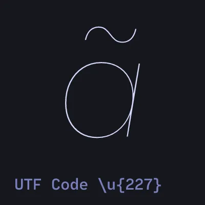
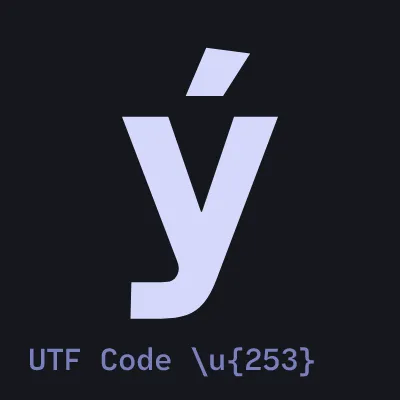
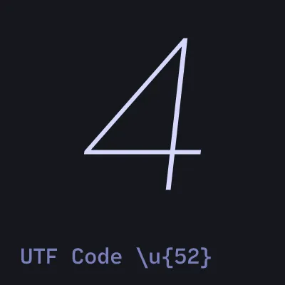
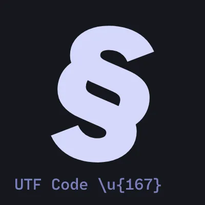
In conjunction with its origins, Stephen wanted to showcase how maleable this typeface is, which is where animation comes into play. Axes representing a continuous space of all the possible weights, angles or sizes are very interesting to animate.
The tools
In order to achieve the final result, a set of increasingly esoteric tools was used:
- Davinci Resolve for final put-together tasks
- Cavalry for very cool animation
- Coldtype for even cooler animation
Davinci Resolve is just a great, classic non-linear editor.
Cavalry is a 2D motion graphics engine that focuses on the composition of procedural animations. It almost feels like a programming language.
Coldtype, on the other hand, is a Python library that allows for extremely versatile typography animation. It can animate any vector asset, but it was designed to sculpt and mold letterforms into almost anything you can think of.
Developing animations in Coldtype
In this section, I want to take a look at some of the inner workings of what one can do with Coldtype. There are not a lot of tutorials available for the tool. Working with it was a lot of trial and error, albeit extremely fun.
Here's an animation that didn't make the cut.
In here we can see an arrangement of numbers in different colors and weights. This animation aimed at showcasing how versatile and flexible numbers are in this typeface, since the whole weight range is put in use and everything aligns perfectly.
This was made using Coldtype. Here's a snippet of the code:
def numbers(f):
    def map_color(i):
        if i == math.isqrt(i) ** 2:
            return ACCENT_COLOR
        elif i % 2 == 0:
            return PRIMARY_COLOR
        else:
            return SECONDARY_COLOR
    n = 9**2
    numbers = (
        PS(
            [
                StSt(
                    f"{i+1:02d}",
                    name,
                    94,
                    opsz=0.9,
                    wght=0.5 + 0.5 * np.cos(i % n * f.i / length_numbers),  # happy with this one
                    fill=map_color(i + 1),
                    features={"tnum": True, "zero": True, "rvrn": False},
                )
                for i in range(n)
            ]
        )
        .grid(every=np.sqrt(n))
        .lead(30)
        .translate(x=30, y=30)
    )

return ( numbers )Let's go chunk by chunk.
def map_color(i):
    if i == math.isqrt(i) ** 2:
        return ACCENT_COLOR
    elif i % 2 == 0:
        return PRIMARY_COLOR
    else:
return SECONDARY_COLORFirst, we defined a map_color function. Its only purpose is to assign a color
to a number based on their index.
If the number is a perfect square, we color it with the ACCENT_COLOR, a reddish tone. Otherwise, we color the numbers based on their
parity. Even numbers are white, odd numbers are blue. Nothing too crazy, and
this is not Coldtype-like stuff. Let's now get into the StSt definition and climb our way
upwards.
StSt(
    f"{i+1:02d}",
    name,
    94,
    opsz=0.9,
    wght=0.5 + 0.5 * np.cos(i % n * f.i / length_numbers),  # happy with this one
    fill=map_color(i + 1),
    features={"tnum": True, "zero": True, "rvrn": False}
)This one is full packed of stuff.
StSt is a Coldtype class that sets a line of
text with a single Style object. This is the way we set type in Coldtype. The first argument
is just a string that depends on i, which is the iterator that we defined in
the list comprehension. This number is then shifted by +1 and padded with 0s on the left, so
numbers align.
It essentially guarantees that the number will always be two digit.
name is just a variable in which we tell Coldtype where the desired font we
want lives within our computer. We declare these with the function Font.Cacheable.
94 is the text size in pt that we are setting our text at.
The variable stuff:
opszis the Optical Size axis codename through which we can change this parameter in our animation.wghtis the Weight axis codename through which we can change this parameter in our animation.
In Coldtype, these extend between 0 and 1, no matter how the actual values are defined in the font file. This makes it a bit easier to animate stuff, since everything is normalized.
wght=0.5 + 0.5 * np.cos(i % n * f.i / length_numbers)We can also see that the wght axis has a lot going on. Apart from the constant
numbers, we are using the cosine function with i and f.i
f.i is the index i for the current frame f. For the
first frame this value will be 0. The second frame, 1. And so on.
The standalone i is the iterator we mentioned earlier, and n is the
total number of numbers that we are displaying.
The actual operations like dividing and multiplying just came out of trial and error. I knew I needed to use f.i to drive a per-frame change on a property (wght in this
case), and I knew I wanted to apply a different styling to each consecutive shape but with a
staggered effect. This led me to use both f.i and i.
I also knew I wanted the overall behaviour to swing back and forth. And the cosine function helps achieving that, since it will always output values from -1 to 1. The frame index + cosine function is a goated combo that shader magicians will also recognize as familiar and, indeed, goated.
But the actual operations that relate them are not important. It was just a matter of adjusting and tweaking until the animation felt good.
fill=map_color(i + 1)map_color function.Next up, we got the fill color, which comes defined by the map_color function we
discussed earlier. Outputs a color depending on the index. Beautiful. Simple.
features={"tnum": True, "zero": True, "rvrn": False}Lastly, one of my favourites, OpenType features. This is something usually overlooked in clicky software, like Adobe After Effects, Cavalry or similar. Design tools do implement it, though, which is why I miss it so much in motion software.
This argument expects a dictionary of OpenType features and their expected value. These act like switches, thus the "True" and "False" we see here. You can turn features on an off to access specific alternative characters within the font file.
Let's review them:
tnumenables Tabular Numbers. Numbers that occupy the same exact space. Essential for the layout we have going on.zerosubstitutes the normal 0 for a slashed0.rvrnis a slightly more obscure, advanced one. It stands for Required Variation Alternates. It forces the characters to not switch to specific variants made for legibility, in order to maintain their continuous nature.
This last one is not super intuitive, but this example will hopefully clear things up.
Focus on the 1. When turned on, the caracter switches to a different version in bolder weights. By turning this off, we tell the font that we want the original 1, which interpolates smoothly across the whole weight range.
Mind you, this feature is a decision the type designer has to make when laying out the roadmap for the typeface. The fact that we get this level of granularity and customizability is truly remarkable.
    PS(
        # ...what we just saw
    )
    .grid(every=np.sqrt(n))
    .lead(30)
    .translate(x=30, y=30)
Now, to refresh, all these numbers were individual text objects we created through the StSt class.
All these objects are then fed into the PS class, which helps with very precise
layout of these objects, and groups them to make operations on all in relation to eachother.
We can see this class brings three nice funcitons:
grid: sets the elements on a grid 🤯. The argumenteveryliterally means make a new row (or column) everynelements. Since we created n to be a perfect square, we just use the square root to layout the numbers. Nice!lead: comes from the leading of the typefaces, i.e line height. Just adjusts the vertical spacing between each row.translate: moves elements around 🤯. Your usual translation. We move the whole thing up and right a bit. By default, all objects are aligned down and left in Coldtype.
🚧 probably to be continued... 🚧